US Building of the Week
Robert Olnick Pavilion
Alberto Campo Baeza & Miguel Quismondo
2. October 2023
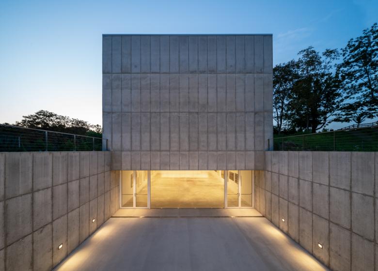
Photo: William Mulvihill, courtesy of MQ Architecture
Five years ago Magazzino Italian Art, an institution focused on Arte Povera, opened its art space in Cold Springs, in New York's Hudson Valley. Just last month, Magazzino expanded with the new Robert Olnick Pavilion. The first building was designed by Miguel Quismondo's MQ Architecture, and for the new building Quismondo collaborated with Alberto Campo Baeza. The architects answered a few questions about the new Robert Olnick Pavilion.
Location: Cold Springs, New York, USA
Client: Magazzino Italian Art Foundation
Architects: Alberto Campo Baeza & Miguel Quismondo, AIA
- Project Architect/Project Manager: Jacobo Mingorance
- Construction Manager: Miguel Quismondo with Jacobo Mingorance
- Collaborators: Ignacio Aguirre López, Alejandro Cervilla García, Tommaso Campiotti, Juan Carlos Bragado, Ignacio de Silóniz, Alfonso Guajardo-Fajardo Cruz, María Pérez de Camino Díez, David Vera García, Sara Fernández Trucios, Luca Redaelli, Gloria Saá García, William Mulvihill
MEP Engineers: CES-Consulting Engineering Services Engineers
Lighting Consultant: MAP Design Studio
Cost Consultant: Slocum Construction Consulting, Inc
Kitchen Consultant: Chef Luca Galli
Site Area: 9 acres
Built Area: 13,000 sf
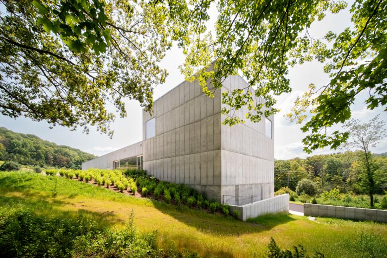
Photo: William Mulvihill, courtesy of MQ Architecture
What were the circumstances of receiving the commission for this project?The Robert Olnick Pavilion, designed by architects Alberto Campo Baeza and Miguel Quismondo, is an extension of the MagaZZino Museum, Nancy Olnick and Giorgio Spanu's Museum of Italian Arte Povera in Cold Spring, New York.
The current MagaZZino is a superb building, designed and built by Miguel Quismondo. It had proven to be so resoundingly successful that it outgrew its size, which is why the Olnick Spanu family asked us to build this extension.
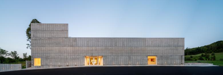
Photo: William Mulvihill, courtesy of MQ Architecture
Please provide an overview of the project.Nestled in a hillside on Magazzino’s campus, the new pavilion is located adjacent to the main building and mirrors the structure in its rectilinear design. With a concrete facade punctuated by windows and a series of skylights, the pavilion fosters a dialogue between art, architecture, and the surrounding natural landscape. The building adds nearly 3,600 square feet of new gallery space to the campus, including two natural light-filled galleries for special exhibitions on its main level and a third gallery on its lower floor for the display of Murano glass, and ceramics.

Photo: William Mulvihill, courtesy of MQ Architecture
The lower level also features a flexible, 1,500-square-foot programming space overlooking a sunken outdoor courtyard that enables the museum to host community programs year-round, including film screenings, lectures, panel discussions, and other educational and public events. On its top floor, which meets the ledge of the hilly terrain, a café and reading lounge with indoor and outdoor seating provide visitors the opportunity for a moment of respite.
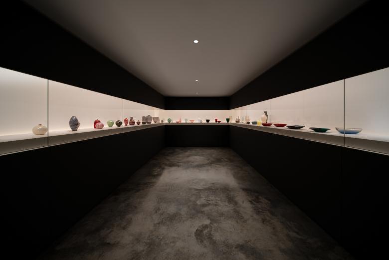
Photo: William Mulvihill, courtesy of MQ Architecture
How does the design respond to the unique qualities of the site?Conceived to complement the existing museum building and reflect its elegant and simple modern design, the new pavilion brings a new dimension to the museum’s evolving campus. With strategically placed windows and skylights, the building introduces new opportunities for visitors to enjoy the beauty of the campus as it adds much needed space for the museum’s growing education and curatorial program and allows for the presentation of projects in new formats. This project reflects both the institution’s growth as well as Nancy and Giorgio’s belief and commitment to the Cold Spring community.
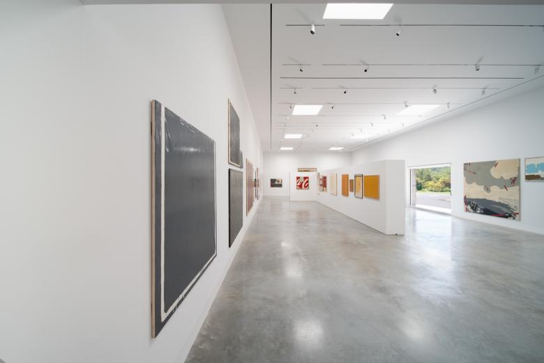
Photo: William Mulvihill, courtesy of MQ Architecture
What are the main ideas and inspirations influencing the design of the building?Special emphasis is placed on the main exhibit area, which is a white, cubic, isotropic space that will house temporary exhibitions and serve as a focal point of the museum. Isotropic space, as defined by the dictionary of the Royal Academy, has the same characteristics in all directions and from any point. If we could fly from the center, the space would be identical in all directions.
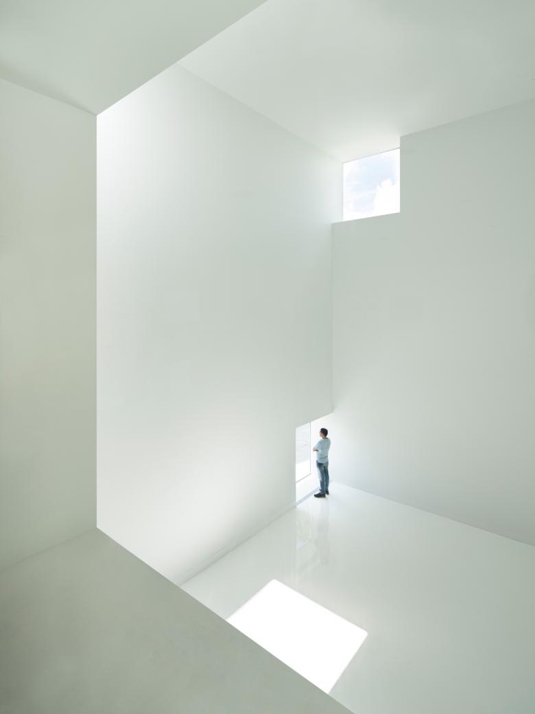
Photo: Javier Callejas
So in that cubic, white and isotropic space, 10x10x10m, at each corner, we made openings of 2.10 x 2.10 x 2.10, so that the sun can enter there at any time of the day. We have chosen 2.10 as the size of the openings so that, when located on walls that are in contact with the floor, they have suitable dimensions to serve as doorways. Two holes thus positioned are the entrances to our white and luminous cubic enclosure. We are very excited with the result.
Email interview conducted and edited by John Hill.

Photo: Javier Callejas

Study model of Luminous Cube (Photo: MQ Architecture)
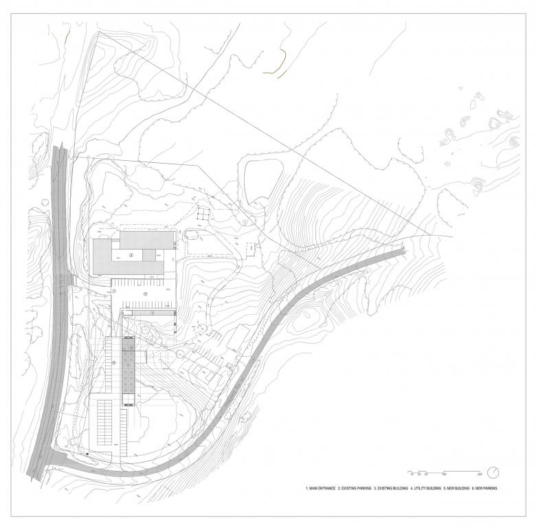
Location Plan (Drawing: MQ Architecture)

First Floor Plan (Drawing: MQ Architecture)

Ground Floor Plan (Drawing: MQ Architecture)
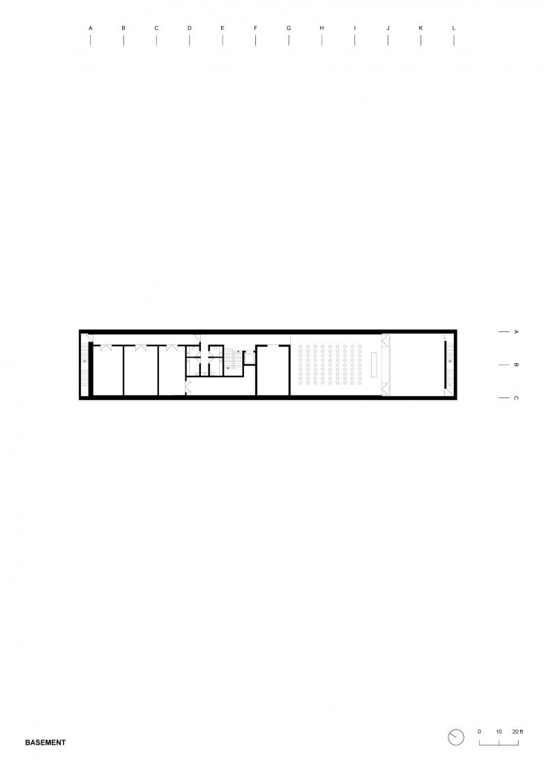
Basement Plan (Drawing: MQ Architecture)
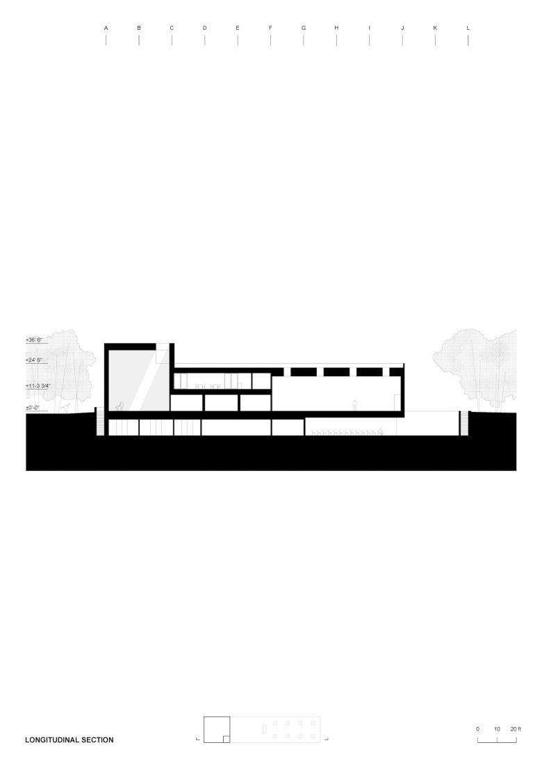
Longitudinal Section (Drawing: MQ Architecture)

Cross Sections (Drawing: MQ Architecture)
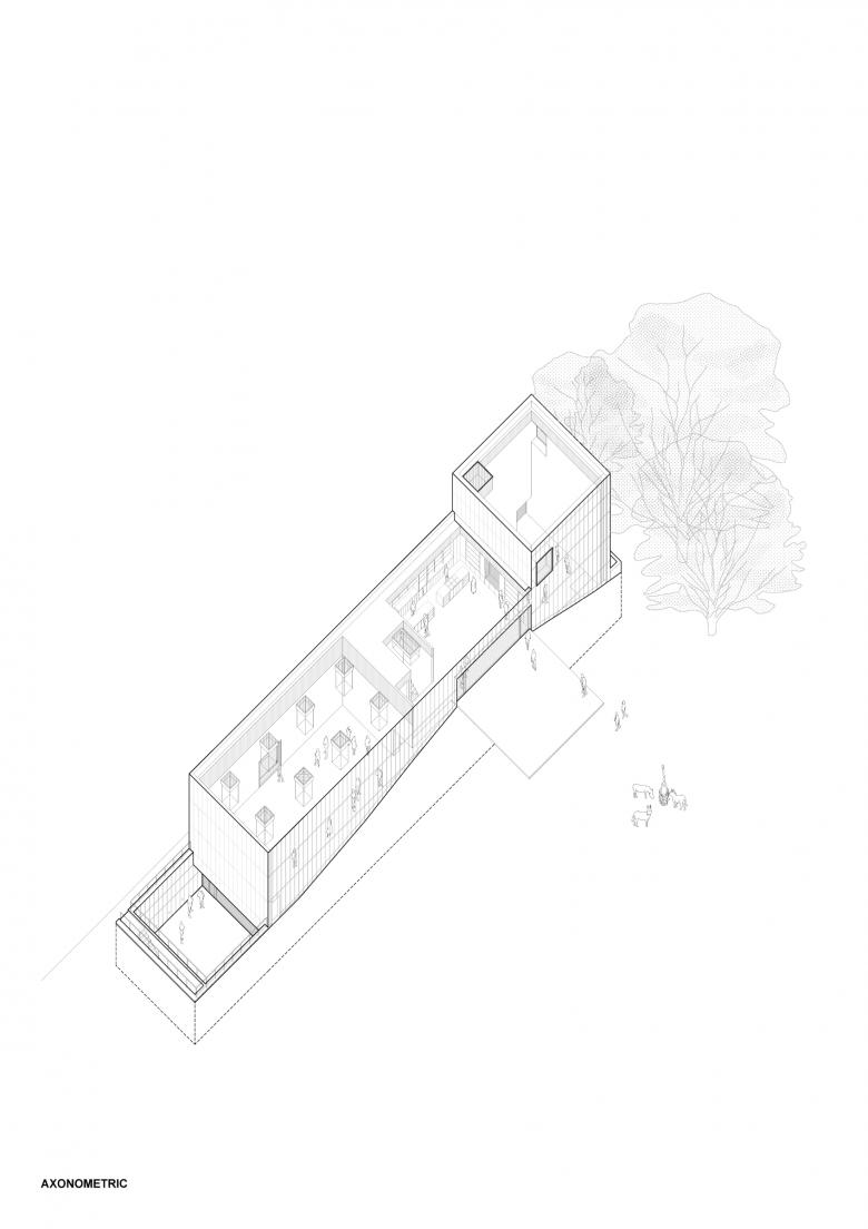
Axonometric (Drawing: MQ Architecture)
Related articles
-
Brooklyn Bridge Park in Photos
2 months ago
-
Walking on Water
on 1/8/24
-
A Day at the Beach
on 10/13/23
-
Robert Olnick Pavilion
on 10/2/23
-
Shelter Island House
on 8/28/23